ROLE Product Design
Research & testing / interaction, visual, & experience design
WHO Blue Cross Blue Shield of IL, TX, OK, NM, & MT
the largest customer-owned health insurer in the United States
As one of the largest health insurance providers in the US, Blue Cross Blue Shield is dedicated to expanding access to high-quality, cost-effective healthcare. They aim to equip members with the information and tools needed to make informed healthcare decisions for themselves and their families. However, they were falling behind of others who have succeeded in creating a stronger digital experience for members. This study aimed to identify gaps between BCBS members' needs and the capabilities of its digital platforms.
Taking a step back with research
First, we needed to understand what was causing disruptions in the experience.
We conducted research that focused on…
What motivates members to be engaged in their healthcare?
What tools do they need so that they engage more efficiently?
What are the main triggers that drive them to call for help?
What are the most valuable tasks members want to accomplish?
Above: While testing the applications functionality with members, we called out all moments that were “working” or “not working” and why in the experience.
IN-DEPTH INTERVIEWS KEY MOMENTS
Interviews were semi-structured to gather detailed information and help understand specific behaviors and mental models.
ease of completion top priority
“I want things to be simple, to the point and in a format I can understand. As long as I can solve my problem or make my decision the tone doesn’t matter as long as isn’t rude.”
Member 1
uneasy with lack of transparency
“I feel that this app has an agenda. If it is a health insurance app they have their own motivations for giving the information that they to give me.”
Member 2
tell me the cost upfront
“I have a very strict budget so it is very important to know what is covered and what isn't. If a surprise bill comes up I have to take it out of my emergency fund.”
Member 3
value of insurance for needs
“So many of these benefits are useless to me because I keep active enough and I’m in good health. Some benefits are important like dental and vision. Drug coverage isn’t important to me because I take zero medication. Gym benefits means nothing. I have normal health and my doctors says I am fine so I why spend the money?”
Member 4
features that enable members to plan for potential costs or coverage issues were the most beneficial and useful overall
TESTING INFORMATION ARCHITECTURE
Going into research, we recognized the need for a foundational understanding of how to organize features and content within our expanding digital toolset. Despite a growing member base, the mobile application had undergone only incremental structural changes in the past five years. This presented an opportunity to optimize the tool's organization to meet current needs and anticipate future growth. To inform the information architecture, we incorporated A/B testing into the research plan. Our goal was to identify the most effective and sustainable ways to structure and label content, enabling members to easily find information and complete tasks.
Initial takeaways
Cost is king. When presenting users with information, one of the top priorities was finding any information that was associated with costs (such as in-network, out-of-network, copays, average costs, etc.).
above: A visual navigation tree was created to see all different possibilities of the current app’s navigation
above: We conducted A/B testing to see determine hierarchy of what information was most important, clear, and what wasn’t.
FORMING DESIGN PRINCIPLES
During synthesis, we grouped common themes together. By clustering similar findings, we developed guiding principles that informed decision-making and maintained project focus throughout the design process.
FRAMING THE PROBLEM,
WORKING TOWARDS SOLUTIONS
Common themes helped size the opportunities to address first:
Money is everything, as per norm.
Members lacked clarity on how medical spending works and how it affected their deductibles, copays, and overall healthcare costs.
Design recommendation: Cost-related information is a priority, so people can avoid surprises and manage their budget. If any costs are available to show, we should show them.
Help me find my info faster
Members wanted top level information first and wanted to be able to digest it quickly. They struggled to understand the purpose of key features. Participants interpreted the pages more quickly when a visual indicator was included in the design.
Design recommendation: Use visual design to help break-up and understand information quicker. Avoid lists without any type of visual break.
Support me when I don’t know what to do
Many people answered questions related to coverage incorrectly, likely due to misunderstanding of insurance terms and processes. Due to a lack of clear content, the app was primarily seen as a customer service shortcut rather than a self-service tool.
Design recommendation: Whether they have a quick question or have need help with a denied claim, members want access to next steps to get help. Showing them that we are continuing to support them through this process would reduce their frustration.
the SOLUTION NEEDED to…
teach members about their health, plans, and benefits to enable self-sufficiency and as a result, improve user experience and reduce support costs
SIZING the OPPORTUNITIES
Moving from findings to feasibility, app usage data showed what members log-in to most frequently use.
This data was used to supplement research findings and to narrow the scope of concepts.
Most commonly used features:
above: spreadsheet created for each feature tested to track implementation priorities
1. Claims
“I want to see if my recent doctor visit was processed and if they entire claim was covered.”
2. Coverage
“What will my copay be to see a dermatologist?”
3. Spending
“Have I met my deductible yet? How much more do I have to spend?”
4. Settings
“I want to receive my plan notifications by email and not by mail.”
———
Keeping it organized
To track design opportunities, spreadsheets outlined the wants, needs, and things that were found to be irrelevant. These were outlined alongside technical capabilities and contractual requirements. This helped visualize design solutions and development priorities which made it easier to identify quick hits, user stories, and areas requiring further research..
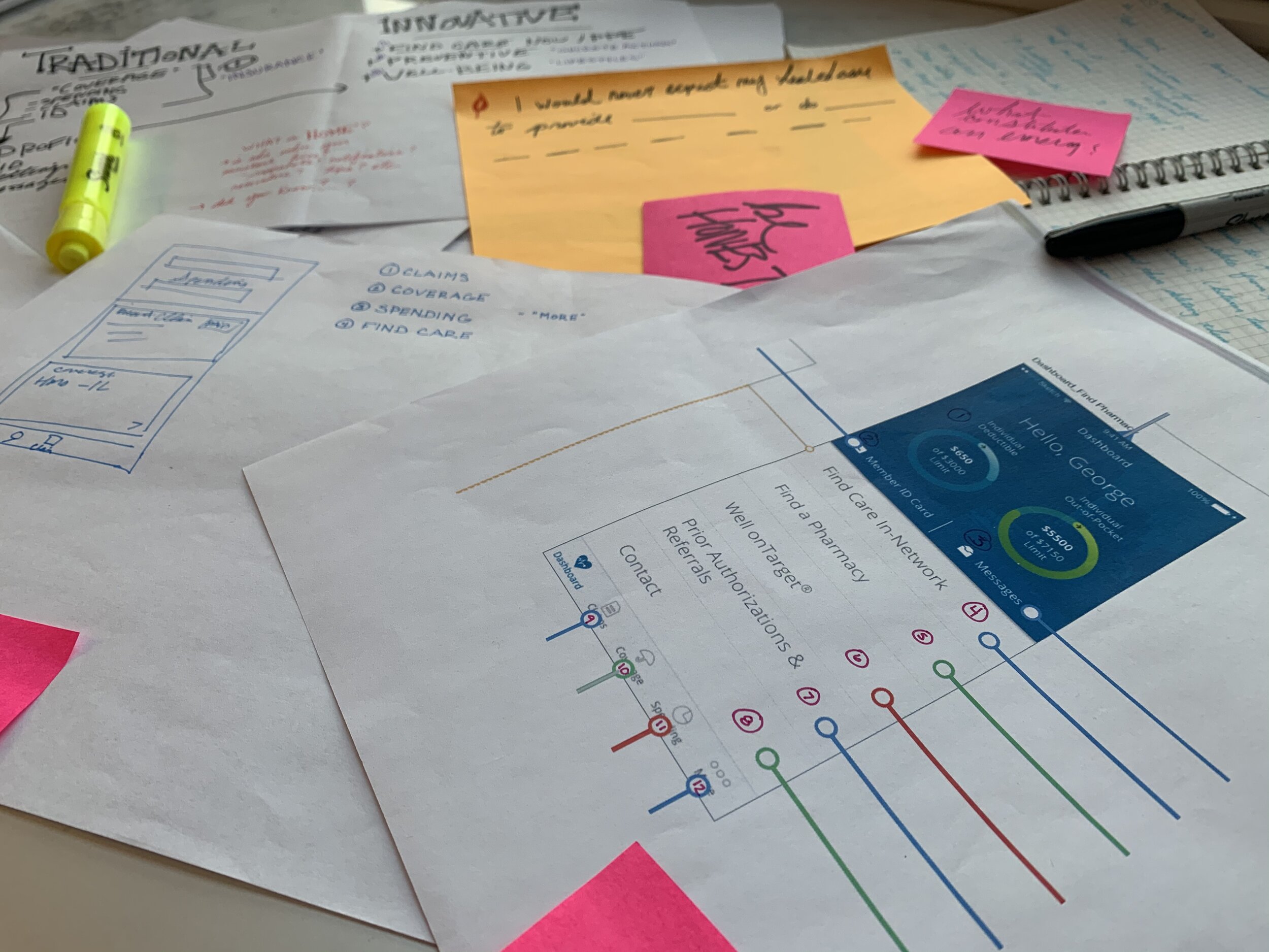
above: just because we are working from home, does not mean we stop throwing ideas up on the wall
THE FUN STUFF:
CONCEPTS to REALITY
Always starting with pen and paper, I began to work out potential design solutions and flows. Of course, this required stickie notes and markers to capture thoughts and questions during the process.
MAKING IT DIGITAL
above: wireframe iterations of feature concepts
Taking the most successful sketches to the big screen with wireframes…
…and then eventually getting to high fidelity
Welcome to the new way to manage your health benefits
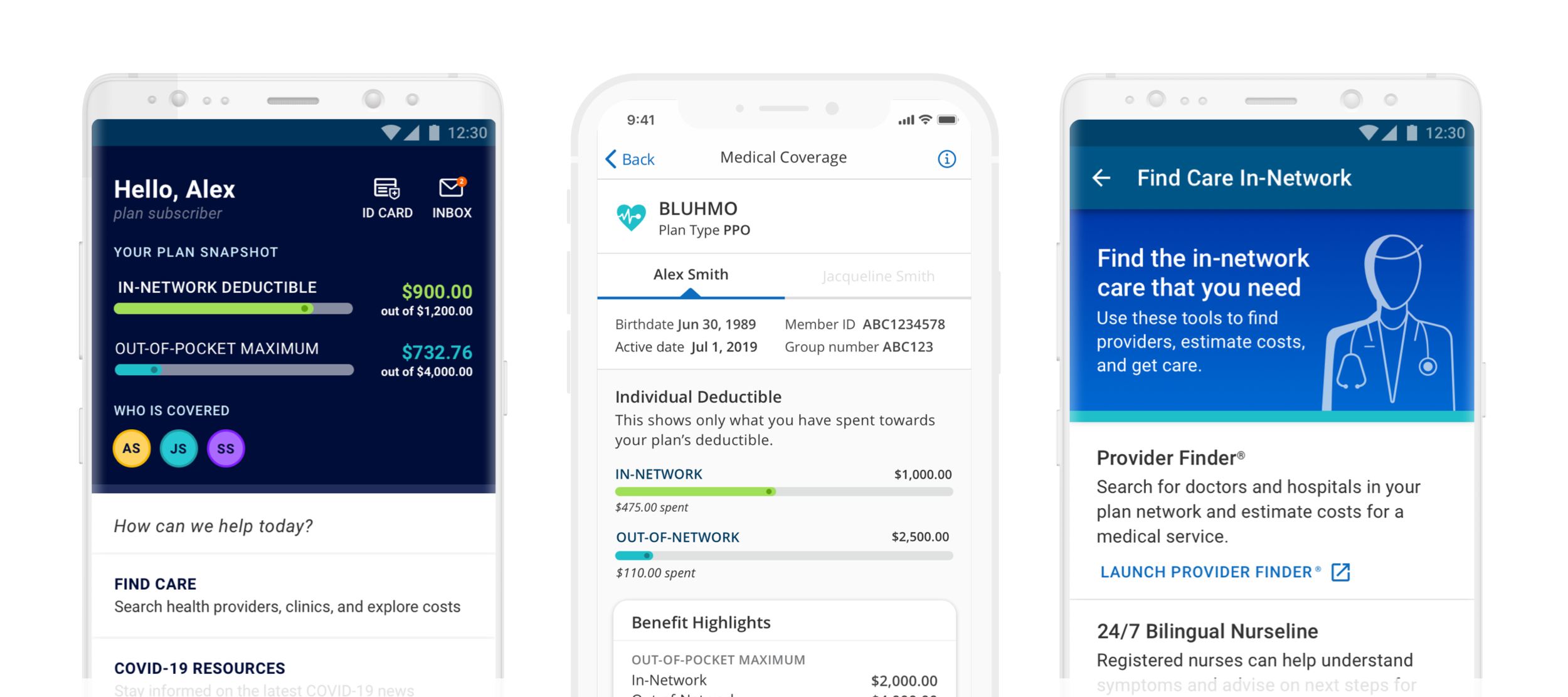
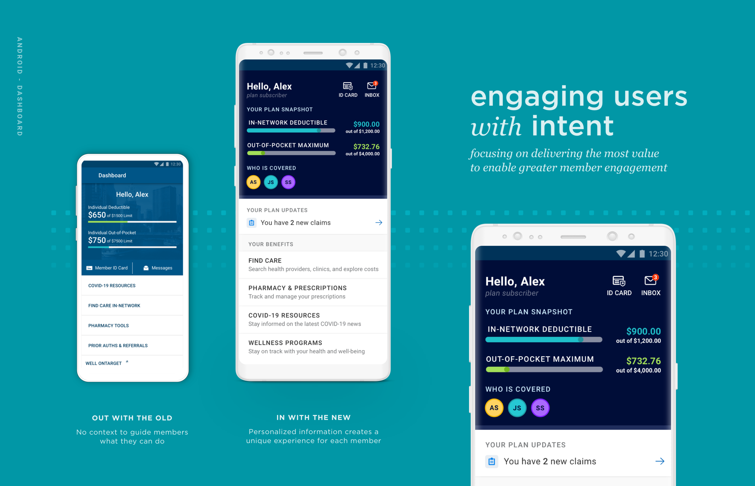
The dashboard makes the first impression on the member. It must relay a digital experience that is simple and welcoming. Yet during testing, participants struggled to determine what actions and tasks were available to take. They felt overwhelmed with options and uncertain about the purpose of the features. An overall lack of guidance caused confusion about where the information they needed was located. Health insurance is already a complex ecosystem, so the dashboard must enable members to find what they need without added effort or question. When rethinking the experience, we knew it needed to be intuitive while feeling tailored to their specific needs and goals. It was a priority to prioritize high-value features while removing less-valued ones. Similar features were grouped together to enhance discoverability. Dashboard items now have clear purposes, addressing previous ambiguity. The dashboard feels more personalized and helpful.
Members valued personalized content curated for each member
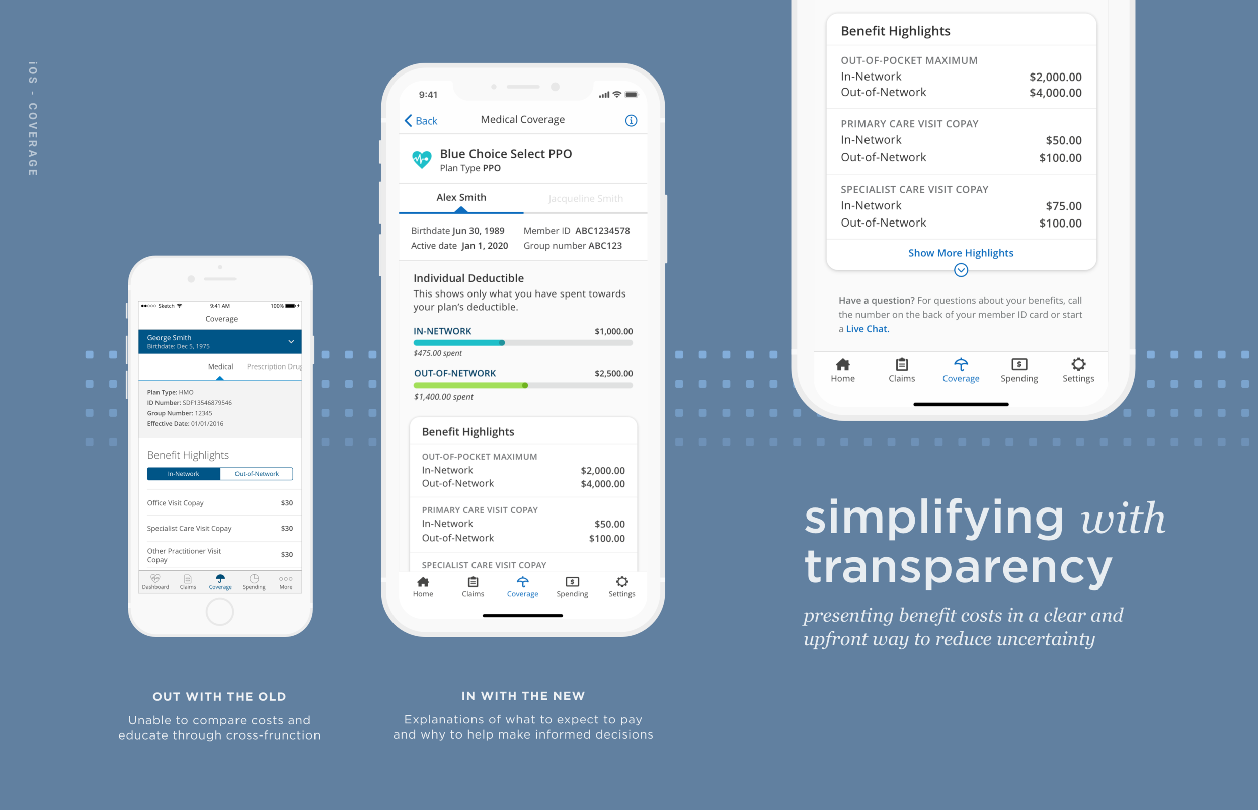
Members expected to see what is covered, but said it was usually unclear
Helping members take control of their coverage
Members said they felt frustrated by health insurers' inability to deliver a smooth, frictionless, and surprise-free experience. With so many benefits and resources obscured, it created a highly-disjointed information architecture in the app. Members voiced that it is often faster and easier to call member support than it is to find the information they needed. Coverage information is a high-value feature. It shows members what is covered, costs they should expect to pay, and basic plan information. We want members to be confident in their understanding of their benefits so the solution needed to empower them to do so. Simplifying plan information helps members understand their benefits, make informed decisions, and use their benefits more cost-effectively. Cost-related information is a priority, allowing members to avoid surprises and manage their budget effectively. If any costs are available to show, they want to see it. Providing clear choices and appropriate information enables easier decision-making when seeking care. Important information is on the surface with details available upon request. Focusing on optimizing interactions to be quick and frictionless creates an easy and fluid path to accomplish tasks.
Adapting to your preferences
Managing and engaging with healthcare extends beyond app interactions. To maximize benefit value, ongoing and informed member communication is essential. Previously, app systems lacked integration. This resulted in multiple touchpoints for coordinating basic information like primary contact and address, password management, and notification and language preferences. Gaining access to their information and having the app adapt to their needs was not simple. To be effective, the user not only has to navigate the app successfully, but also understand the information being delivered. The app needs to communicate in the language they speak and how they want to communicate. Adding adjustable language preferences helps members feel confident and comfortable with their health decisions.
Members wanted to easily adjust how they recieve plan updates
Seeing your spending in action
Members were confused on what they had to spend and the relationship between deductible and out-of-pocket max
Keeping healthcare costs low is a priority. Creating a clear relationship focused on saving money makes an insurance application useful. However, members were confused by basic spending functions. For example, members asked if they had to meet their deductible before paying for medical coverage or if things such as copays were part of deductibles. If their spending information wasn't displayed plainly, the app was just a way to call customer service. Rather than being a place where they can answer their questions, it created more questions, making the function obsolete. Members do not use the app to understand how insurance works in general; they want to know how their insurance works for them. Pairing context with visual graphs, helps aid in how they interpret their spending progress. Providing accurate and specific details will transform the mobile experience from an occasional resource to an essential tool.
the work is never fully done when your goal is to deliver better software and experiences, continuously.
areas of further research to test, learn, and explore:
1 Could coverage and spending merge to deliver a deeper understanding of how systems connect?
2 Would a guided onboarding improve people’s understanding of content? What tasks may benefit from being supplemented by outside activities and why?
3 Are there different ways of explaining insurance terms that foster better understanding? How do members best learn and retain information?
4 To further understand behaviors, investigate what surroundings, emotions, previous events that led to utilizing the app and why?
Team: Kelly Kenson (design), Laura Paradis (research)


