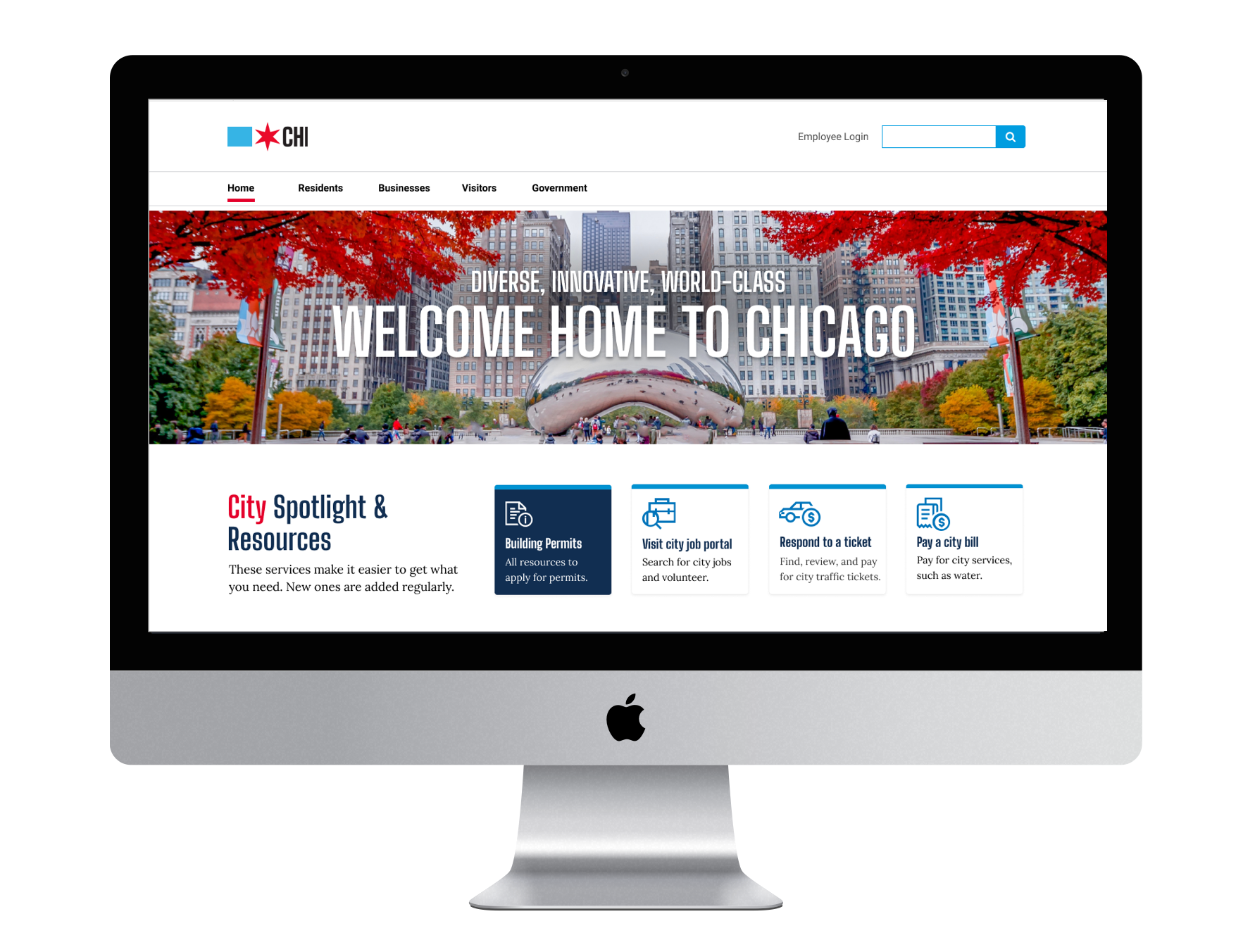
This project was completed to fulfill the requirements for DePaul University’s M.A. of Experience Design degree. Partnering with Jason Kunesh, design director of the City of Chicago, our team focused on increasing the usability of Chicago’s website for its residents making information more accessible and succinct.
In a time where digital experiences rule, it is time for cities to take the infrastructure of their digital portals as seriously as they do the in physical infrastructure. These city webpages are often the first impression people are given. When a city does not invest in their digital presence, it risks itself of losing the engagement of their residents and isolating others.
When a government’s website is intuitive & easy to use, it improves the user’s trust in the government as it allows them to efficiently complete tasks & find needed information. If a user is unsuccessful in getting what they need from the website they often resort to calling. This ultimately raises the cost of government by making all transactions more expensive.
research methods utilized
Secondary Research Researched trends in civic tech understand how digital services are used throughout government to inform design choices. Also further validates user insights from primary research and create a stronger case for the overall design.
Competitive Analysis Helped define strengths & weaknesses of the website when comparing to like-product that helps make informed decisions about the end solution.
Task Flows Used to show high-level steps that a user would take to accomplish a specific goal.
Flowcharts Used to see if the steps of top tasks are logical, to uncover problems or miscommunications, define the boundaries of the problem space, & develop a common base of knowledge.
Data Analysis Analyzed current user behavior to identify common tasks and goals.
Usability Testing Performed usability tests with potential end users to identify any usability flaws.
Designing the experience Chicago deserves
To make Chicago more resident-focused we need to do the hard work upfront to make tasks simpler for them. We created a space that's fully dedicated to residents wants & needs. We deemed this space the “resident hub.” Here residents see content that is specific to them so they are able to quickly identify services and resources without having to navigate through content that is not relevant to them.
Designing for the frustrations of the residents
During research it was found that there is no easy way for residents to find all the services that are specific to their neighborhood in a single place. Resources are scattered around the website, housed under different departments and sometimes even different entities of the city. Information and resources regarding trash pick-up, street closures, parking, nearby schools and parks. We knew it was important to bring all of this information into a single location.
Focusing on the resident
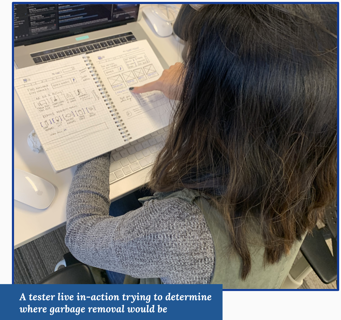
Low fidelity concepts were tested with users with these design elements:
Search bar takes priority at the top to allow visitors to search to find services in their neighborhood
Trending requests are placed at the top for quick navigation
Hubs of large resident concerns are placed into cards below
A dynamic search at the bottom to assist those who do not know where to go
we put the concepts in front of Chicago residents…
…some things failed and that is okay.
we heard ‘em say…
“I like having trending topics at the top, but the two search bars is really confusing.”
“I think the boxy layout makes it easier to navigate because you can glance at it and quickly know where to click.”
“I’m more interested in the services and being able to do something with that information.”
“I’m typically panicked, curious, or annoyed I got a ticket and this lets me navigate without making those things worse.”
After three rounds of iteration & testing it was found…
There needs to be a balance of content & action Residents wanted information, but also valued it more highly when it was associate with a direct action
Language is vital to guide function Choice of words and phrases need to be clearly understood by all. Clearly define, label, and explain each item in a way that is intuitive to visitors
Why are there so many city websites? Testers were unaware of the difference between 311 and city services so it is important to delineate when they are leaving the city website to be redirect to 311 or other government entities.
Limit the amount of photos to increase trust Testers had an adverse reaction to options with a lot of real photography used saying it looked like ads. It is important to utilize visuals that aid in the transparency and trust of the city
"Chicago’s neighborhoods have always been the city’s greatest strength."
- Jane Byrne
where we started
Knowing the solution needed to represent Chicago’s values & the people that embrace them.
The City of Chicago’s website no longer represents the values of the new administration and has outgrown its current structure, creating an experience that is confusing, frustrating, and time-consuming for its visitors
where we ended
Moved from city-centered design to resident-centered design.
Welcome to your Chicago.
The final “resident hub” is dedicated to the residents of Chicago and serving their needs. Top requested services and resources are prioritized at the top of the page giving quick access to get in and out. Additional resources and tasks are organized by clearly defined topics that are meant to create an intuitive navigational experience where visitors can recognize where the information they are in need of can be found. It was important to reduce the amount of visual clutter to give a welcoming and friendly experience for residents to interact with. We want any resident to come to this site and feel that it is inclusive of their needs, wants, and their community.
Customized to fit your needs.
A large portion of the original website’s content was dedicated to business-tasks. The average resident would not be interacting with both residents and business services so we felt it important to separate the two. This allows these portals to be dynamic with the content and language they use in order to best serve their user population. Additionally, the design of the business hub showcases how the utilization of a design system and the use of design patterns create a cohesive experience while navigating the website.
Evoke that Chicago is transparent, innovative, & effective.
Through design we can…
Create create a cohesive experience that is unique to the city
Be representative with imagery that is transparent and represents all residents
Speak in a language that shows that Chicago is a welcoming, transparent, and ethical city to do business, visit, and live
Promote Chicago in a way that aligns with the values of the Lightfoot administration: inclusion, equity and transparency
This project was completed as part of a 2019 collaboration between City of Chicago and DePaul University Graduate students
Team: James Chesterfield, Kadie O’Malley, Christanne Siamas


