ROLE Product Design
Research & testing / interaction, visual, & experience design
WHO Blue Cross Blue Shield of IL, TX, OK, NM, & MT
the largest customer-owned health insurer in the United States
BCBS sought to empower members with comprehensive healthcare information. However, their mobile app's coverage presentation was lacking, hindering members' ability to make informed decisions. This case study aimed to reimagine coverage information within the app, prioritizing user experience and understanding to create a more effective and valuable tool for members. By focusing on clarity, transparency, and ease of use, the redesigned coverage feature would not only enhance member satisfaction but also contribute to positive healthcare outcomes.
When it isn’t broken, but there is more to explore
When I assumed leadership of the BCBS native app, it hadn’t received a significant update since its initial release. This provided an ideal opportunity to temporarily pause development of epics and focus on user research to understand user preferences, needs, and pain points.
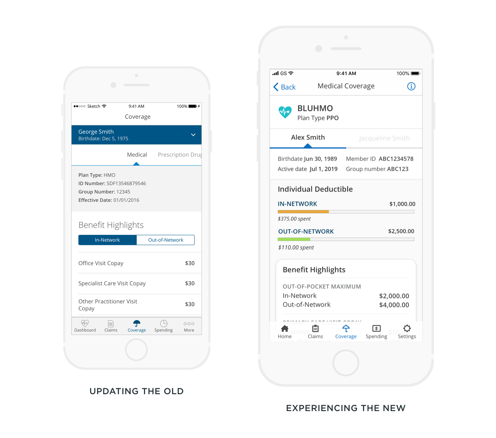
Pictured Left is where we began. Right is where we will end.
let the research begin
Initial research involved identifying our target user base and analyzing both our existing product and competitive offerings. In-depth interviews with members were conducted to gain an understanding of their values, wants, and needs. User testing then helped us refine the technical interaction.
we heard members say…
“If it is confusing I ask people. When you look it up it is too vague. It’s lawyer-speak. ”
“This app thing I don’t want it on my phone because I don’t think I would ever use it because I am a healthy guy. ”
“Healthcare is just over my head. How they bill things, what’s in-network, what goes towards your deductible and what doesn’t...”
“There’s no clear way to understand the true cost. I shouldn’t be scared to get the bill.”
At the end of our research, analysis, & synthesis we understood that…
Members didn’t understand the language being used which increased the times they would call customer service.
There was no enticing benefit or value for them to download the app.
They wanted to engage in a relatable insurance experience that felt like they were interacting with a trusted friend.
They felt there was too much ambiguity in the digital content which in turn instilled a fear of cost & underutilization of their benefits.
Armed with a renewed understanding of our members' needs, we began iterating based on their feedback.
The design process included sketching, wireframing, and multiple rounds of iteration
where we started
Knowing the solution needed to enable members to feel confident
We understood that the design solution needed to empower members to make confident healthcare decisions by eliminating any knowledge barriers or complex language. We aimed to instill confidence in members, encouraging them to utilize their insurance coverage more fully to not only achieve health but also maintain it. Research indicated that members felt least confident about the costs associated with their policies and the scope of their coverage. Consequently, we recognized the imperative to clarify and redesign the explanation of coverage.
where we ended
Creating experiences that foster self-efficacy to achieve optimal health
Compare what you’ve spent with your policy costs.
Members repeatedly expressed their greatest fear: the cost of their plan. They often overlooked benefits they had and their associated costs, whether high or low. To address this, the design included a side-by-side comparison of their deductible spending and actual coverage costs.
Understanding your coverage’s language.
Health insurance is often confusing, convoluted, and explained in terms that are not easily understood by the average user. Research revealed that a significant number of members lacked a basic understanding of insurance fundamentals and common terms. To address these knowledge barriers, educational elements were integrated throughout the app. Wherever an "i" icon appears, it indicates an opportunity for the member to learn more about the information, its meaning, and any applicable qualifications. This allows members to stay within the app without needing to search for terms or policies they are unfamiliar with.
All your insurance coverage details in a single hub.
Initially, this experience did not natively display all members' coverage information. Instead, it directed them to their desktop online portal or physical benefit booklet. To view their complete coverage, members had to swipe through multiple pages. To address this, the design was updated to prominently feature a high-level overview of all their plans. This allows members to quickly see what is available without navigating through unnecessary information. They can then choose to explore each coverage type in more detail.
Check what is covered while on the go.
The primary advantage of the mobile application is its portability. For this reason, information must be presented in a way that is easily recognizable and accessible. Previously, in-network and out-of-network costs were separated by a segment control. As members were confused about what was covered and what was not, it was crucial to display these two values together for easy differentiation.
A streamlined experience brought to a singular screen.
Experience the new interaction: Members remain on a single page dedicated solely to that policy. They can reveal or hide highlights to explore more of their coverage options.
Team: Kelly Kenson


